Assuming an aspiring cannabis company can overcome the high hurdles of permits, taxes, distribution, insurance, attorney fees and the other challenges of regulatory compliance, there’s the question of branding. The legal cannabis market is growing ever more crowded with products—flowers, yes, but also cannabis-infused chocolates, body lotions, pet food, tea, lollipops, oils and more. It’s a veritable bud bazaar, and without a memorable name and consumer-friendly branding, it’s easy for a company to get lost in the marketplace. Or disappear.
For branding agencies working with cannabis companies, it’s an exciting time. There is no precedent of an industry bursting from the black market onto store shelves. (Alcohol was legal before it was illegal, remember.) As such, there are no rules for design firms. And there is a lot of money.
In 2016, California’s legal medical cannabis industry generated $1.8 billion in revenue. The Arcview Group, a cannabis investment and research firm in Oakland, forecasts its value will hit $5.8 billion in the next four years.
“One of the big reasons that I’m excited about designing for this industry is that we’re not beholden to history,” said Christopher Simmons, creative director for San Francisco design agency MINE, in an interview with Adobe’s 99U magazine. “If you’re designing liquor packaging or chocolate packaging, you already know what high-end liquor looks like and what bargain chocolate looks like. . . . Pot doesn’t have that yet; it’s too new. We’re like the designers who created computer packaging back in 1985—it’s exciting to be at the forefront, setting a standard that other people will follow.”
As cannabis entrepreneurs seek new markets, branding is necessarily evolving beyond images of pot leaves, dreadlocked skulls and stoner double entendres.
“People are getting tired of the High Times, Cheech and Chong stereotypes, and ready to bring brands out with their own ethos and narrative,” says Zack Darling, co-founder of the Hybrid Creative, a Santa Rosa cannabis creative agency. Not that Darling, who grew up on a pot-growing hippie commune in Mendocino County, has anything against Cheech and Chong. He has bobbleheads from the comedy duo in his office and can rattle off lines from all their albums.
But the new market isn’t geared toward cannabis comedy fans. It’s focusing on seniors, pet owners, athletes, Lululemon-wearing yoga practitioners and female luxury market niches. “What’s really going to allow the industry to grow are new markets,” says Darling. “It’s not going to come from current pot smokers.”
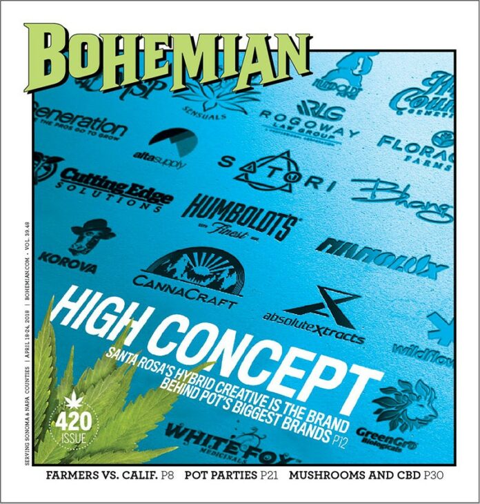
The Hybrid Creative has created childproof packaging, logos and complete brand identities for some 80 cannabis companies, many of them heavyweights in the industry, like AbsoluteXtracts, Korova and Care by Design. The Hybrid Creative spun off from Darling’s ZDCA, which focuses on non-cannabis clients. With the explosive growth of the cannabis industry, Darling and his team of 12 find themselves at the right place at the right time. Cannabis clients now account for about 70 of the company’s business. The firm has clients in California, Germany, Australia and Canada.
“We have a tiger by the tail,” says Darling. “It’s very volatile.” He sees a “brand brawl” for market share in cannabis. “Everybody’s got their foot on the gas pedal.”
As a brand strategist, he advises clients to find their “why.” And for him, that means being value- or purpose-driven.
“The key to a purpose-driven brand is authenticity,” Darling says. “We believe people don’t buy what you do, they buy why you do it.”
To the extent that cannabis businesses survive, it will be in part by dint of their stories, their values and how they communicate that, says Darling. And that’s where he and his team come in. After finding their “why,” clients work with the firm’s creative director Laurel Gregory to create the imagery that showcases their mission.
I sat down with Gregory and Darling to get the story behind some of the brands they created.
White Fox Medicinals
“White Fox is very much a West County, ‘woo-woo’ brand geared toward women,” Gregory says.
The company makes formulations based on spirit animals or totems. The creation of line-drawn spirit animals (whale, stag, crow, owl, hawk) was a natural. “[The owner] was trying to blend the spiritual side with consumer tastes,” says Gregory.
While the packaging looks like a female-focused cosmetic brand, Gregory decided to render the images in black-and-white to move the design a little more toward the masculine side to widen the products’ appeal.
WildSeed
The owner of WildSeed, maker of cannabis vaporizer cartridges, has roots in Earth First! and is committed to social justice and change. Twenty percent of sales go to groups “led by those negatively impacted by the war on drugs and mass incarceration. “Gregory began with a cartoonish, playful-looking bird for the company’s logo, but the image was too frivolous for a company with a serious intent. The final version she came up with was a more austere, noble-looking bird in flight that better reflects WildSeed’s mission. The cartridge is housed in a beautiful, embossed flip-top cardboard box.
Earthen Farms
Willits-based Earthen Farms touts its artisan-curated and -grown biodynamic cannabis, so the brand name “Earthen” is a good fit. But the company wanted to convey a modern, less crunchy aesthetic. Gregory drew on Bauhaus design to create a geometric logo that is clean and modern while still “earth-bound.” The cannabis is packaged in a childproof, recycled composite lid that screws onto a Mason jar. It’s old-school, ecologically minded and modern all at once.
Korova Edibles
Korova, which made its name in cannabis cookies, is one of the industry’s most iconic brands, thanks to its bowler-hatted, three-eyed cow logo. The company has a towering billboard that looks down on motorists on Interstate 680 in Fairfield. Korova’s owners are big fans of A Clockwork Orange: Korova was the name of the infamous “milk bar” that Alex and his droogies frequent, and their cow’s bowler hat and lavishly lashed eye are signature images from the movie.
To build on Korova’s pop-culture irreverence and launch its line of flowers, Darling and company encouraged Korova to commission a street artist to paint a mural at their Oakland headquarters. Each strain now features a different piece of the mural on the jar, and boxes and bags are similarly adorned with elements of the bright street art.
In this case, the Ultraviolet is definitely preferred over the ultra-violent.


