Craft beer label art explodes
You may have noticed that craft beer has taken the supermarket cold box aisle by storm. Along with the revolution in unique brews has come a new spin on the look of beer cans and bottles.
Sparked by Petaluma’s Lagunitas Brewing Co.’s legendary Lagunitas IPA label, the North Bay—perhaps more than anywhere else in the country—marries the art of beer with the art of, well, art.
“We put a lot of work and care into our brewing process and ingredients,” says Paul Hawley, co-founder of Fogbelt Brewing Co. out of Santa Rosa. “I try to approach our labels with a respect for everything that went into the liquid inside.”
“Our brand is about bold simplicity,” says Bryan Rengal, co-founder and Head of Sales at Old Caz, named for West County’s Old Cazadero Road. “Each can stands out on a shelf but doesn’t distract from the taste of what’s inside.”
“We think of our beers as elegant and balanced,” says Erin Latham-Ponneck, chaos management specialist and adult in charge—a.k.a. general manager—at Santa Rosa’s Moonlight Brewing Company. Moonlight’s bold, simple designs make a marked distinction from many busier labels commonly found on other craft beers. “On a packed beer shelf our elegant and balanced labels stand out in a sea of loud, busy cans.”
As suits the counterculture ethos of craft beer, label styles often go against trend. “Our labels are edgy because they are not edgy; we don’t follow the status quo or trends, we don’t go in for hype,” Latham-Ponneck says. Brian Hunt, founder and heart and soul of Moonlight adds, “One problem with ‘edgy’ is that when one goes too far, one falls off into the abyss of BS.”
But Is It Art?
Perhaps the most famous example of this balance between bold and buyable is the Chupa Chups lollipop wrapper designed in 1969 by the surrealist painter Salvador Dali. Still in use today, the label had an of-the-moment artistic appeal that catapulted the Spanish candy brand into global recognition and brought in billions of dollars in revenue. Art leading commerce.
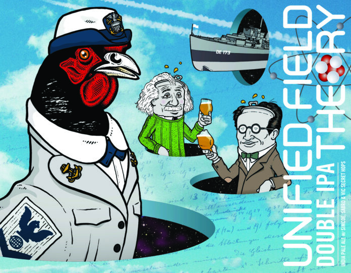
Josh Staples, of the HenHouse Brewing Art Department, says, “Making the art on our cans an additional level of entertainment for our customers is very important to everyone at HHB, for sure.” HenHouse’s signature “Hen” character, which Staples invented and drew, is often depicted costumed in humorous scenarios. Let’s cut to the chase: “Beer drinkers are going to be spending some time with these cans in front of them and in their hands.”
This conceptual approach to marketing has its roots in great design.
Hawley has “been drawn to the graphic style of block and screen printing. The exaggerated contrast and colors, use of negative space, and limited palate can create powerful imagery that is anything but subtle.” The classic design approach conveys a real sense of place. “Most [Fogbelt] beers are named after giant coast redwood trees found in the fog belt of Northern California, so many of our labels reflect this connection to the outdoors.”
Rengal is “a fan of Buckminster Fuller’s ‘Do More With Less’ ideas and the concept of design through engineering. Practical and aesthetically pleasing can happen at once.”
“I’m a huge fan of Chris Ware and his Acme Novelty Library,” Staples says. “Basically, cartoons for grown-ups from the ’70s and ’80s.” Ware’s is a graphic design-leaning art “influenced and inspired by hand-illustration, typography and printing.”
Yet, this is art that sells. “[Our cans are] recognizable from 20 yards and the more beers on someone’s shelf, the more expressive the brand becomes as the Old Caz rainbow [of monochrome cans] shows itself,” Rengal says, explaining the practical advantage of a unique-looking label.
Staples has “hand-drawn and specially created [a number of fonts and typefaces] for the company,” carrying forward the DIY origins of craft beer into its branding.
Outsider Art
The last great major-brand beer labeling coup may have been the Coors mountain logo that turns blue when cold, saving potential drinkers the trouble of using their sense of touch to determine drinkability.
Craft beer companies rarely have the resources for such vital innovations.
“When the lockdowns came in 2020, we lost 100% of our business income,” says Rengal of Old Caz. “Kegs were no longer going to restaurants and our taproom was shut down, so we immediately pivoted to cans. We reached out to a couple designers, but couldn’t afford it so decided to step out of our comfort zone and figure it out.
“I used a borrowed account for Adobe Illustrator and spent a weekend watching YouTube videos and tutorials and playing around with the program … within a week I had our first can, Free Craigs Tropical Hazy IPA, ready for the printers.”
Rengal and his team are used to doing things themselves. The brewery was built “with very little money using broken down equipment and salvaged parts.”
Fogbelt Brewing makes it a point of pride to support the talent in the art community. “The art for our labels comes from a variety of artists,” Hawley says. “We often collaborate with local painters, graphic artists and photographers. I do a lot of the graphic design in-house, but prefer to work with people who are much more talented.”
Staples invented the image of the hen that spawned HenHouse-the-brand. “The constant, stoic hen keeps it all consistent,” he says. “These days, we also have an awesome in-house marketing team keeping track of the beer family tree, and how the story and labels all fit together with the beer roster.”
It’s in the Name
Great art needs a great title. Names like Little Sumpin’ Sumpin’, Hop Stoopid and Phase Shift—from Lagunitas—set the tone as the modern craft beer industry took off.
Latham-Ponneck takes the fun seriously. “We believe you should always have a sense of humor, hence our fun beer names,” he says. “We design as a team, always seeking input from all of our employees. It’s a collaborative process.” Creating together is a part of their company DNA.
Rengal agrees that “craft beer is meant to be fun! Beer names can be inside jokes, social commentary or just a silly reference, and a good ‘sticky’ name can lend itself to loads of creative expression. There’s LOTS of room for creative types to thrive in the beer industry, because at the end of the day we’re not putting rockets into space, we’re not doing open heart surgery, we’re making beer.”
“I’ll just draw a couple silly 3D holes with silver cans that look like Einstein and Schrödinger popping out of them,” Staples says, about the winning strategy of whimsy. “Then, with a handful of ideas in place, I can just draw pictures and listen to records all day.” Perhaps he works with a HenHouse Oyster Stout at hand. This writer did.


